Note: An accessibility overlay is not a substitute to actually fixing your website accessibility issues and should be taken more as an extra toolset for users who might have some customization needs that differ from the original site design.
Areas of Interest
Font: Enables the user to both enlarge the text and switch between sans serif, serif and OpenDyslexic font, the latter being a font specifically developed to help people with Dyslexia. Bing able to alter text size/type is especially relevant to people with low vision or other visual impairments.
Cursor Enhancements: From being able to enlarge the cursor to visual reading guide the cursor options are not only meant for people with visual impairments but also offer a way to better focus on the website content.
Color & Aesthetics: Turn off CSS, hide all the images or switch to dark mode version of the website.
Multimedia: Gives the user control over animations, audio, video, etc. that might be present on the site.
Site controls: Displays an overview of page links, headers and landmarks and allows the user to navigate through an alternate path.
Description of Controls
If you are more interested in the UI of the overlay scroll down below.
Font & Text Controls
Font type: Serif, sans-serif & OpenDyslexic.
Example: Due to its common usage in books and other printed media some people find it easier to read longer texts in (familiar) serif font.
Font size: Allows the user to enhance the text size up to 500%.
(Maybe not so fun) example: Due to my poor vision I could actually conduct an experiment / user test with myself for this one... It was strange.
Text spacing: Allows the user to increase the space between letters. Benefits people with low vision or dyslexia who might need more space to ease their reading process.
Font controls active on Monsido website: OpenDyslexic font with 200% zoom and 3px text spacing.
Emphasize option active together with the enlarged cursor. Monsido.com
Cursor Enhancements
Cursor size: Switch between regular and giant cursor.
Example: A regular cursor can be hard to detect for people with visual impairments, that is why thankfully most operating systems allow their users to scale their cursor according to their needs.
Focus: Switch between Emphasize and Reading guide.
Example: It is common for people to highlight snippets of text while reading long content on screen. Turning on, f.x. Emphasize dims the rest of the page so the user can bring their attention to what is needed.
Color & Aesthetics
Contrast: Choose between Dark Mode, Inverted colors and Greyscale.
Example: Greyscale, while looking funny, can especially be used by people with color-blindness since it is harder for them to distinguish between certain color combinations.
Turn off CSS: While often also helpful for able-bodied users turning off CSS can make the page much easier to use for people relying on keyboard navigation.
The Greyscale option adds an overview to the whole site, including images. Monsido.com
See the images' ALT text on hover. Monsido.com
Multimedia
Pause all multimedia: Pause any kind of video or audio playing on page.
Toggle animations: Gives the user control over animations playing on site. Unfortunately a lot of websites still don't allow the users to pause gifs and other animations even though this being a must for example people prone to seizures.
Toggle audio: Turn off those obnoxious autoplay sounds.
Hide images: Hides all images on page.
Example: Removing unnecessary clutter from page can create a more welcoming space for people with concentration problems.
ALT text: Displays alternative text next to images.
Site Controls
Highlight elements: Highlight all links, headings and/or buttons on site.
Site menu: An alternative route to navigating the website through links, headings and landmarks.
PA keyboard navigation: Operate PageAssist through keyboard shortcuts alone. Besides being fully accessible by regular keyboard navigation PageAssist also offers shortcuts for every option available.
Cookie Preferences link hovered. Clicking on the eye icon on the right brings the user to the location of the link. Turned out to be a necessary add-on as links tended to repeat throughout the page. Monsido.com
PageAssist UI
A brief overview of the visual design choices for PageAssist.
Inspiration around me for design
PageAssist widget was always shaped a bit differently than the rest of the platform. Moreover, since it is added as an extra widget on the webpages of our customers, it had to have a certain "fits-to-most-places" look.
The controls laid out bare in the design document as a supporting artboard
Role of PageAssist buttons
The default PageAssist buttons have two characteristics that often overlap:
- Toggle option on and off like a light switch
- Circulate between different options
These properties need to be accessible at the same time via shortcuts.
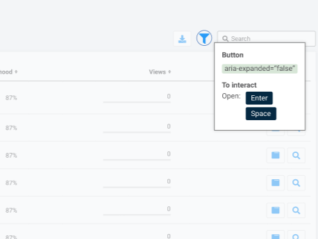
I decided to design the options as large flat buttons for clear distinction of options, also for people with lower visibility and keyboard-navigation users (even the carousel buttons have focus-indicators highlighting the interactive part of the button depending on if the user wants to navigate to the left or to the right).
The choice of icons and option naming is quite standard across similar tools with the icons changing for audio and animations to reflect their current state (I call them "off" icons).
For the naming, the sense-making of the different controls around us and the examples from the real world were the reasons why the user can turn on/off animations and audio but hide images.
The Pesky Pause Button
While the rest of the controls follow the same logic - switch options on and off, the multimedia pause button has a bit different characteristics on how it behaves.
Pressing the Pause button in PageAssist is not an on/off situation but rather an action that can be forced multiple times. Clicking the button will command to pause any media on page, whether they are activated or not.
Why is the button pesky?
The biggest problem with this control is that while the activated buttons above receive an indicator that an option is active, this one has no "active" state - it is just a command. Therefore, the problem arose: it feels like the button is broken because nothing really indicates that something is happening / has happened?
Inspiration from the '90s
I am old enough to have used cassette players when I was a kid. My aunt still has a small radio/cassette player that I heavily abused when 7 years old. The player had a pause button that had to be pressed down. Once the button was pressed down it couldn't be pressed again, it remained down until you pressed the Play or Stop buttons, in which case it flew up and was usable again.
It was the pressing down motion I wanted to somehow capture because even though happening behind the scenes the pausing control operated exactly the same way as my aunt's old cassette player. So I took inspiration from neomorphism and elevated the button from the rest. The action the user took also needed to somehow mimic the button forcing its command to the page. In order to display that the pause button will show a 1-second loading stage (even though the command is instant).
The command to pause all multimedia is commenced.
Special thanks to the Monsido team and everyone who worked on this project!
