Prototyping for the visually impaired

Criticism towards the big prototyping tools
Imagine you need to test out some particular feature's new UI. For most cases, you would just create a prototype in one of your preferred tools - whether it is Figma, Sketch or Adobe XD - and set up a session with the appropriate target group. 
As a person who has used all three abovementioned tools (we will not speak of Invision) during her career, I was quite confident that this case would also be easy-peasy, especially considering how advanced prototyping tools have become in recent years. Unfortunately, I was once again reminded of how forgotten are people with any kind of disabilities when it comes to the web. Since this particular UI had to be tested on actual blind people certain considerations had to be taken into account: the prototype had to be fully keyboard-accessible, it had to be able to mimic screenreaders and the actions taken inside the prototype had to be confined in its designated space.
What I found out was that this was not thought about at all when I started my work. In the end I stayed with my own preferred tool - Adobe XD, because it managed to provide me with what I needed the closest: it allowed key-mapping and text-to-speech, which were the most important. I still had problems with certain screen readers (looking at you, NVDA), but overall it was available to access the actual thing.
I'd like to end this paragraph by expressing hope that in the future the mainstream design tools would think more about the different users on whom their prototypes need to be tested on, some of them not so able-bodied. 
Filter selection being opened in a dropdown

Since the filtering feature needed a touch-up anyway, this gave me a perfect opportunity to also take a deeper look into keyboard accessibility.

The case - redesigning a filtering tool
Being properly accessible inside Monsido product is one of the company's highest priorities. Unfortunately sometimes there emerge some small features, most likely overlooked from a long time ago, that can cause certain accessibility problems. It is part of my job to find and redesign these features to make sure they are accessible for all.
This particular case revolved around redesigning our filtering system for data tables. It was brought to our attention by one of our accessibility expert associates, who is visually impaired themselves. It was obvious that this feature was basically impossible to use without the use of both sight and a mouse (in addition to some other outdated UX practices).
Just my luck, I had already started working on the visual improvements for the overall filtering feature and improving its keyboard accessibility was obviously also on my list. 
Old & Strange
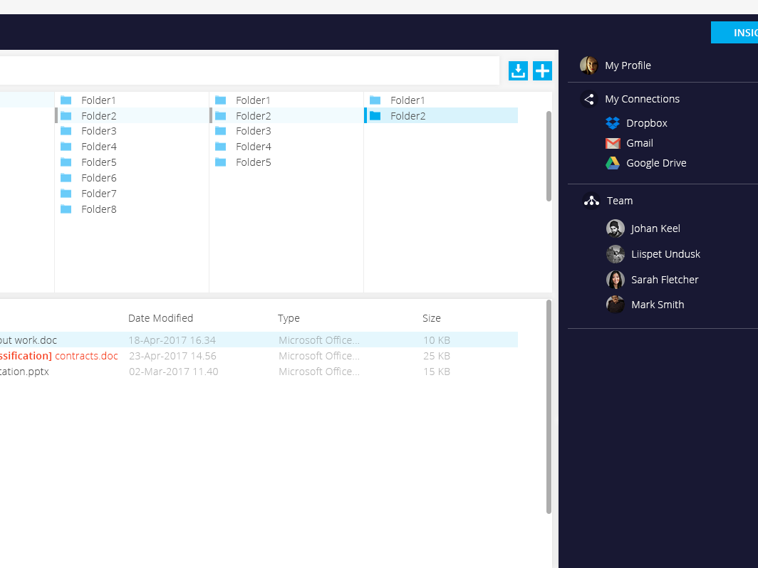
To understand the importance of needing to re-design the previous filtering tool, take a look at the illustration on the right.
- Clicking the filter button expanded the dropdown at the other end of the table: not only is this kind of behavior disastrous for accessibility, it is also just simply bad UX. One should not skate across the page to access their content.
- No keyboard navigation: even though, once again, mostly associated with accessibility, being able to use arrow keys or Tab to navigate through list content is something that benefits us all.
- Incorrect labeling: No aria-expanded/aria-selected labels to communicate to screen reader users what is happening - no way to understand if a filter is selected or not unless you can see the visual mark.

Filter component being expanded from the wrong place

An illustration of the previous UI. The filter button is on the right, the dropdown opens on the left.

Creating a prototype
Instead of the usual design process I would rather introduce you to the accessibility prototype I created to test out my own research on the matter. 
As mentioned at the start, the prototype was created in Adobe XD and meant to be used with VoiceOver. The view could only be interacted with a keyboard and I used Voice Feedback to mimic the intended labeling. Besides that constraints around the digital prototype had to be set up so the user wouldn't "keyboard" themselves out of the assigned area. 
The overall setup was very simple: the users were shown a button with a multi-layer dropdown and they had to activate the different filters it offered to sort out the imaginary folders in the background.
For this project we worked closely with people from Inkusio who helped us test out the prototype and give helpful advice. 
Prototype screenshot where the user has tabbed on the filter button

This was the "workspace". On the left side we have the imaginary folders divided by category and language. On the right side there are extra instructions for sighted users. What can't be seen are the voice instructions. 

Prototype screenshot where the user has activated a filter in a sub-level dropdown

The user has navigated down to the sublevel dropdown to activate the Vacation filter.

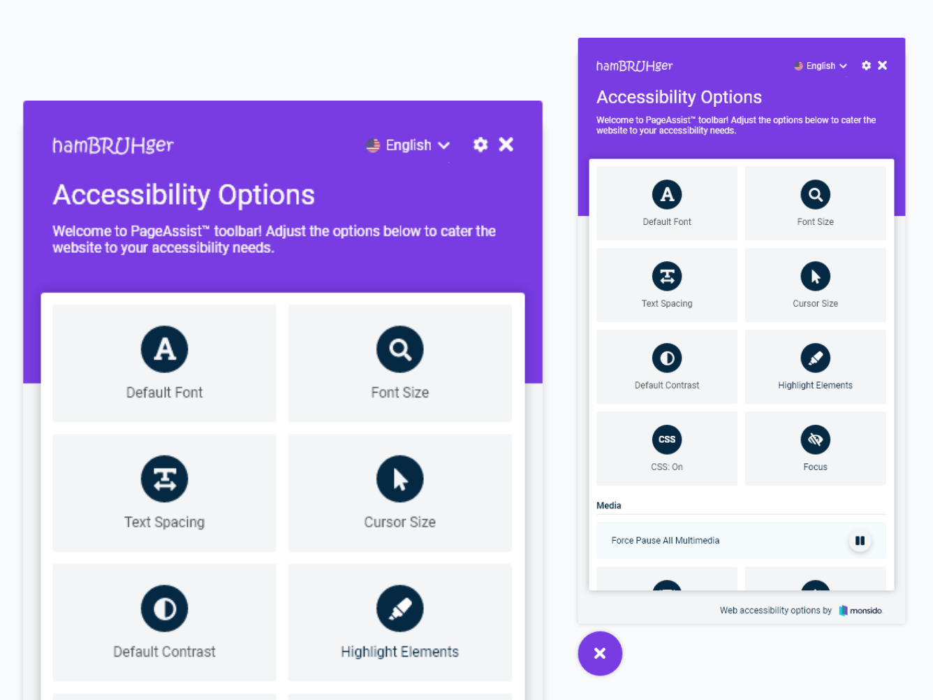
Labeling dropdown open with a guide to correct labeling and keyboard navigation

A clear guide on how the user should be able to interact with the component.

Correct labeling
An important part of this prototyping session was to nail the correct aria-labeling and to test that they were read out at the correct times and when "it made sense". The feedback needed to be instant, just as it would be for able-sighted users. 
What made this a bit more challenging for me were the multiple levels of filter selection. I have created accessible dropdowns before but adding sublevels and selectable list items complicated things. I found myself wondering about things that seemed obvious, yet not at all - should clicking Tab when at the last list item close the sublevel or not and other small tweaks I wanted answers to through testing.
Once I had determined the correct labeling and confirmed that via the prototyping session I of course created a helpful guide for the developers (image).
Browser constraints
Since obviously Adobe had not really thought about people wanting to create projects that include correct keyboard accessibility (Tab), the user's keyboard actions could not be contained in the prototype area. This meant that it was very easy to wander off into your browser tabs and having to spend an eternity to get back (unless you were a mouse-user and could just click on the XD view). 
In order to combat that I had to set up constraints in certain views where clicking Tab would transfer the user out of the prototype area. The best method to use was a Voice Feedback action triggering for that certain key press. The voice guiding the user was also distinctive enough to understand that it was not supposed to be the fake screen reader talking.
Screenshot of the prototype with a red line around it

Do not leave this area!

Feedback
The overall feedback was very positive which just showed me how important proper research for this kind of topic is. 
Some of my certain insecurities were addressed: 
- When a selection is made in a list the dropdown would usually close, however in this case it was an exception because multiple options could be selected at the same time. 
- The possibility to tab through the list items is an important addition to arrow keys as some people would perhaps not guess the navigation pattern
- The status of an option being selected is one of the most important parts and it needs to be read out every time when the user reaches that item, not only after an action has been made

Next steps
As the first round of design and testing was over, the development team was on board what was going on, it was time to move the ball to their court. With my guides and the technical consultations between Inklusio and the development team, the project is going along great. The next testing phase of testing will already happen with an actual built component, which I am certain will pass the requirements.

A quick recording of how it is to interact with the prototype (+audio)
You may also like

Back to Top