Background
Penneo KYC is an AML/KYC tool, mostly for auditors, lawyers or anyone who is required to know-your-customer by law. The users of it can differ enormously - from large companies to small, from customers with complicated high-risk clients to a consultant who deals with your local mechanic shop.
By 2025 (and after working on this product for more than two years), it had become clear that the old design (from UI to codebase) was just not cutting it anymore. Besides constant performance issues, the overall way the product was built and laid out, was not just causing distress to our customers, but also to ourselves whenever we needed to build a new feature.
After convincing the rest of the company (which wasn't too hard considering all the issues), KYC Reborn project was born. Here is how it went.
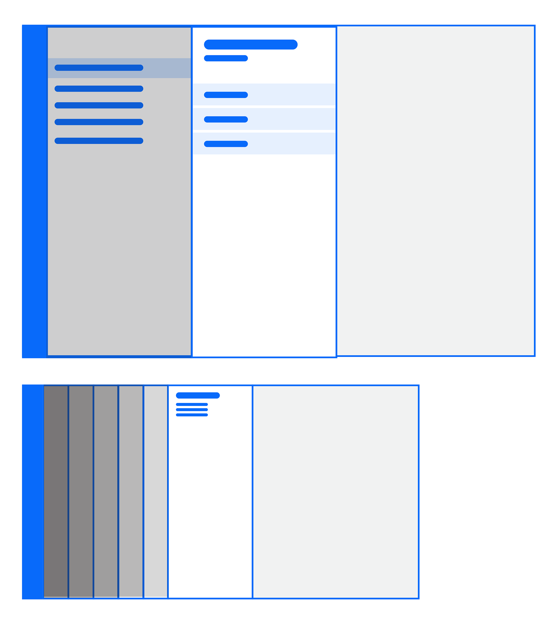
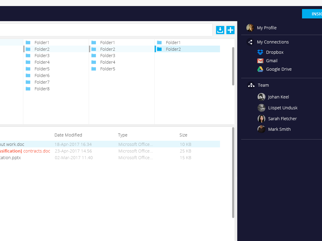
While I won't be able to show the actual product, this was generally the layout of the platform - clicking on a menu item led to opening a new panel on the right side and so on and on.
Internal & external feedback
Customers
- The UI is based on linear thinking - step by step process when completing a KYC case. In reality that is not the case. A client relationship can require the user to go from documentation verification to editing client information - those steps should be treated equally.
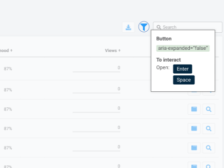
- Pane-specific layout caused performance issues when the users "went into a loop" - caused frustration and disruption of work.
- Confusing navigation: Especially once a number of panes were opened and it was necessary to "return home".
- Overview of clients caused frustration because they were forced inside a narrow pane.
Engineers
- Technical challenges when creating new features - lead to long delays in releases.
- Outdated codebase
- Harder maintenance
- Complex codebase and strange layout of UI led to longer onboarding for new developers.
Designers
- Strange layout made new UI and feature development challenging
- Limited space, forced narrow view and built-in confusing navigation
The complaints become hard to ignore
In Penneo KYC discovery was consistent and respected - that allowed us to notice trends forming over time. At some point it was hard to ignore that a lot of customer frustrations did not come from lack of features or us not understanding their work flows, but rather that the problem lied somewhere deeper - in the overall foundation of the platform.
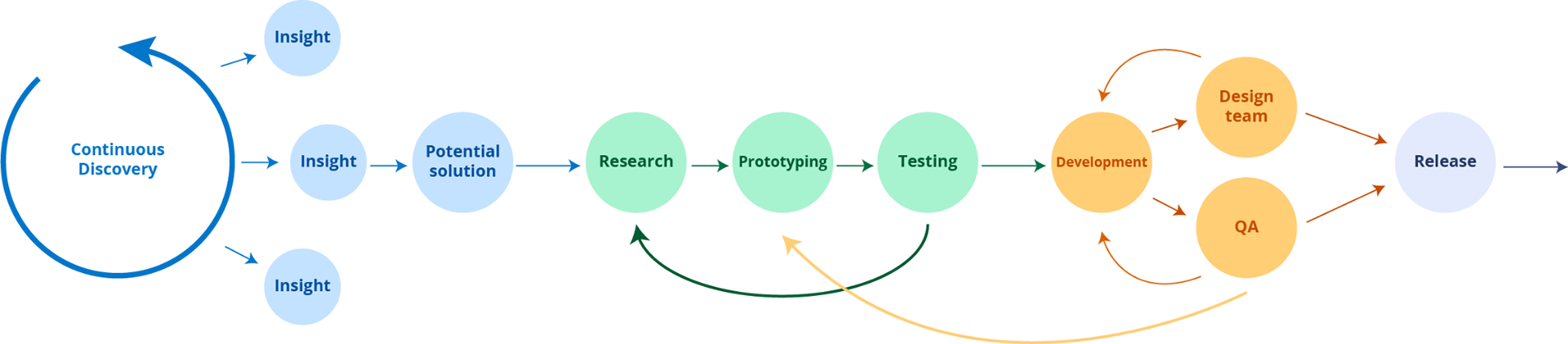
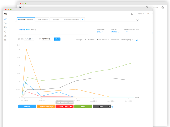
The product development cycle applied in Penneo KYC team.
Identifying key points of improvement
Together with engineering and with help from CS and other stakeholders, we sat down and tried to pinpoint what exactly needs to be changed.
Outdated/strange code base
Making a deep audit for our codebase revealed that it was somewhat "beyond saving". It turned out that re-building everything from scratch would've taken less time than trying to fix the existing code. Re-building the product could also allow the engineers to make the improvements they deemed necessary for future smoother development.
Remove painful panes
Modernize the look and feel of the platform and remove the narrow-pane limitation for user interactions. This would make for more logical navigation and overview of important features.
More logical workflows
UI that enables the customer to behave in unison with how they actually work. The platform allows flexibility for the user to work based on their own internal processes not force their hand to behave in a certain way.
Proper alignment with Penneo Design System
Because of the strange codebase it was hard to fully utilize our Design System, which led to a bunch of half-baked solutions. Re-designing the system would allow us to build the system with clean, tested and accessible components.
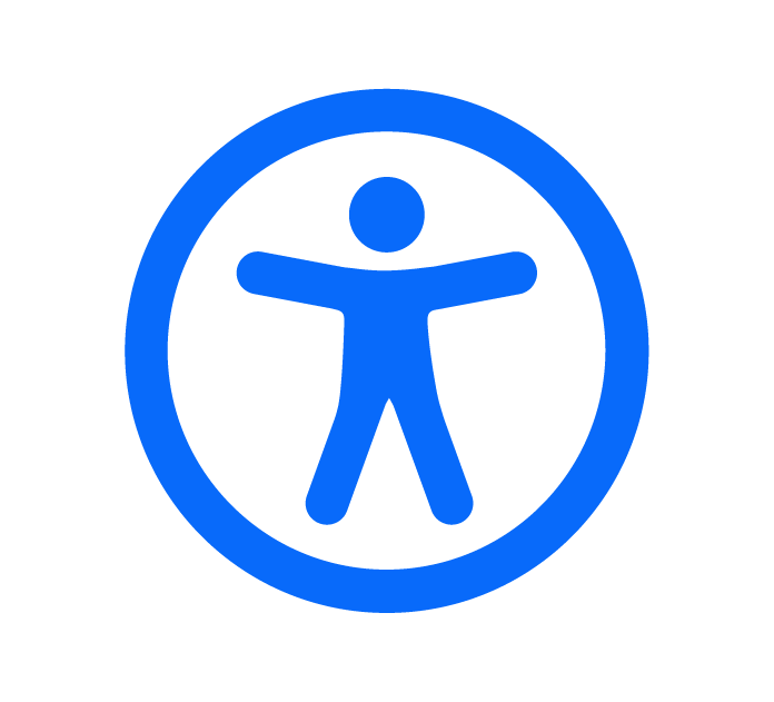
Better accessibility
The strange UI layout and outdated components also lead to some serious accessibility concerns. A re-design with our tested Design System components would help enormously.
Sketching out ideas
A re-design of a product can be one of the most liberating projects to work on in a corporate setting. We had a ton of insights and feedback and were suddenly given free hands to explore all of it. The work flows of our customers were suddenly not constrained to obscure feedback forms and Miro boards but they could be brought to life within our UI.
The approach I used for the basic layout was layered. I tried to imagine how different customers with their unique needs could co-exist in the same platform and that included the really strange use cases. The platform had to be flexible, catered to customers from lawyers to auditors, from one country to another, all with different compliance levels.
The main challenge was not really the overview itself - it was more how all the different customized features would be reflected in the UI.
Moving away from panels was the right choice - just where would we fit all the stuff they held?
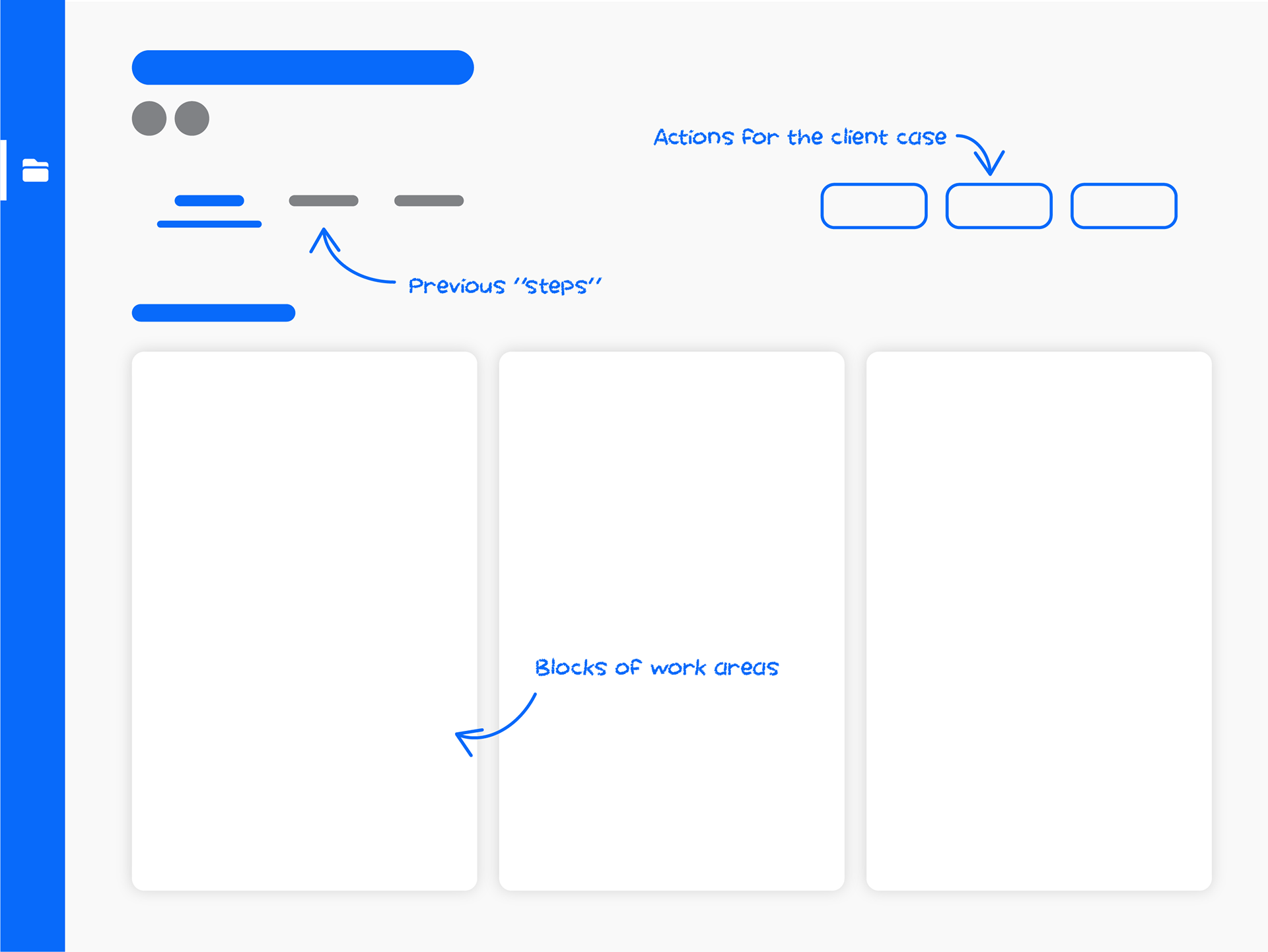
Some of the earlier prototypes
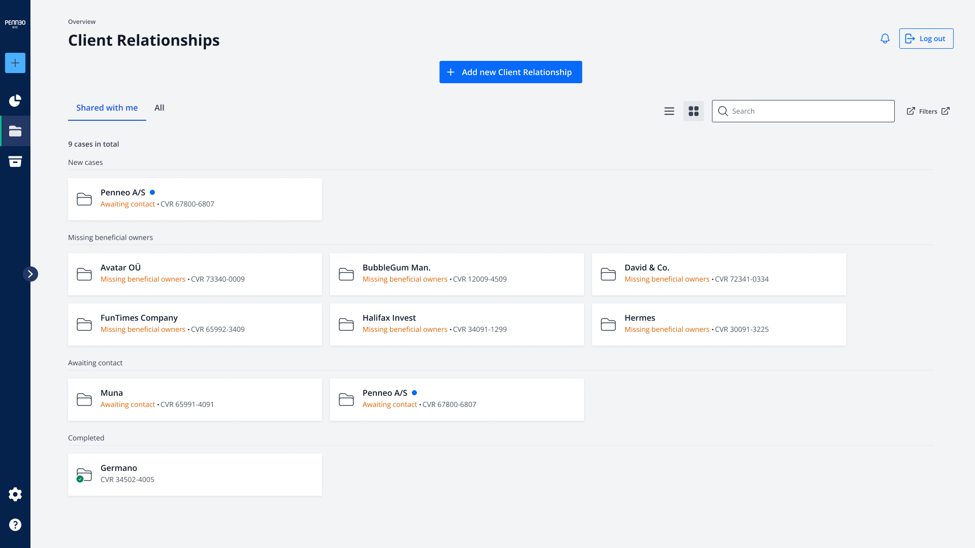
Client relationship overview page
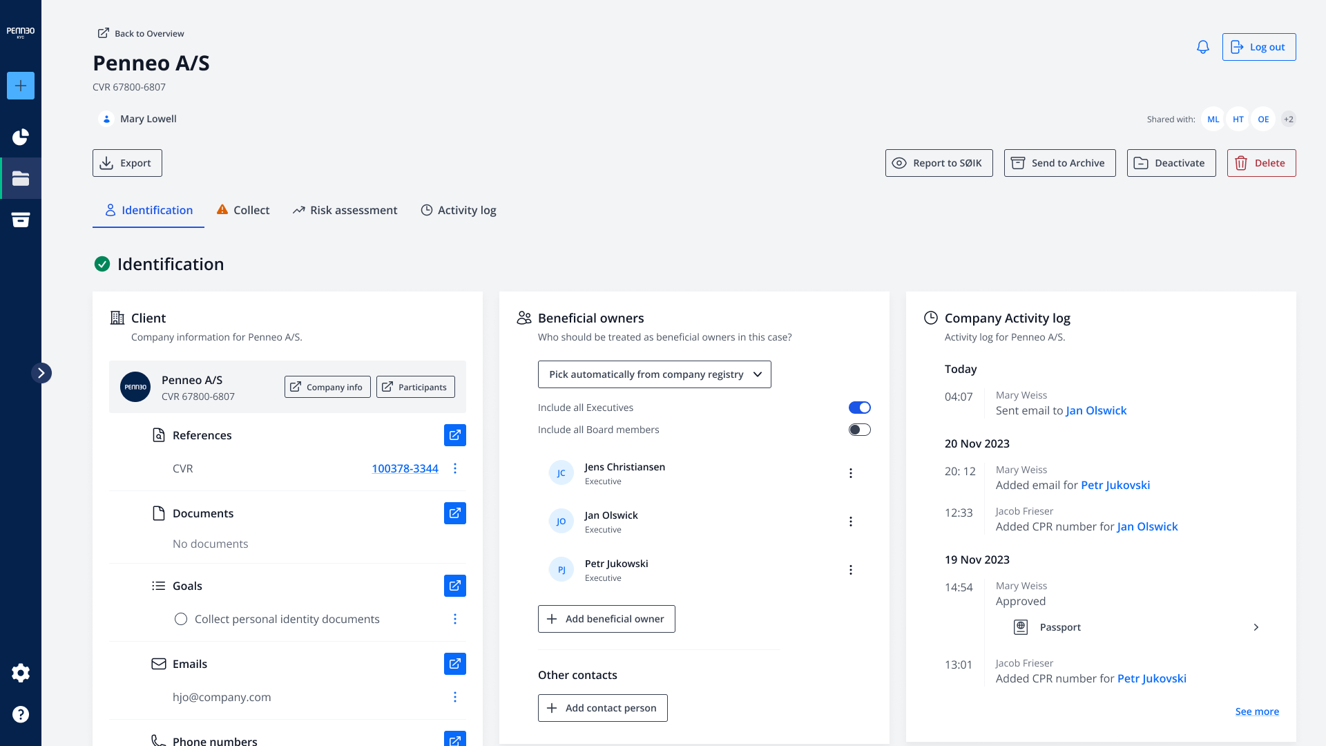
Identification page - here can you see an overview of client information and everything about which persons are connected to the case.
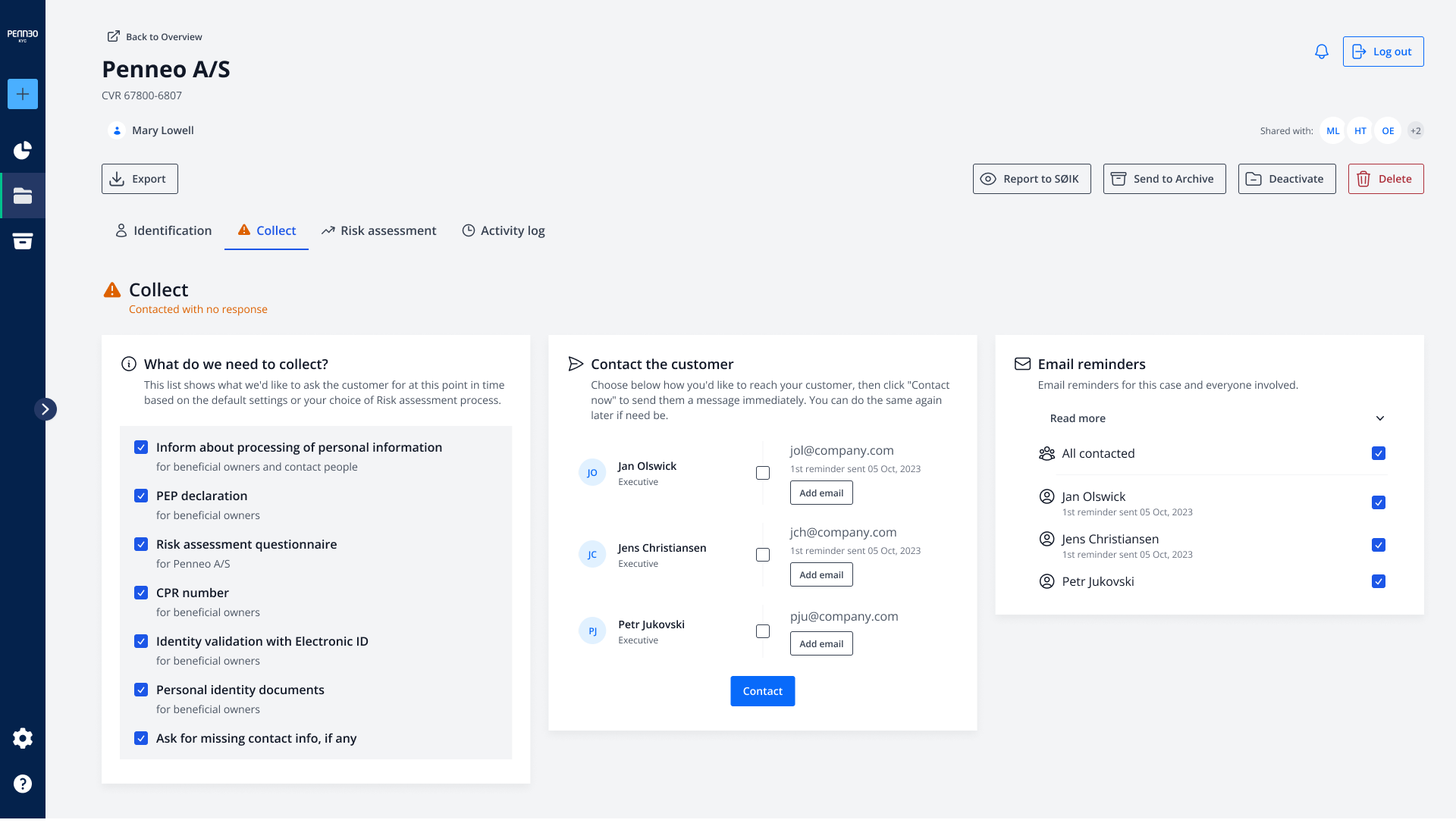
Collect page - choose which documentation is necessary and from who.
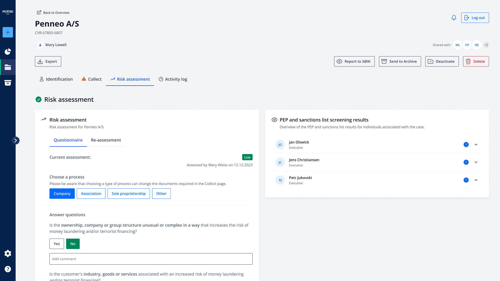
Risk assessment - once everything is ready, answer the questionnaire and create a risk assessment for the case.
Hackaton madness
While the team had great ambitions and the overall direction was well-received, it was still the question of convincing upper-management that this would be worth to pursue instead of continuous feature development.
Thankfully, we had a Hackaton rolling up.
Within a week, the team worked together to actually build a semi-functional prototype that allowed people to actually engage with our vision, not just through a Figma file. When presenting our project it suddenly became clear how much more logical the flows where (suddenly all the customer feedback made sense) and how much the performance had improved.
The idea was sold.
And yes, we made a pretty cool presentation for it.
And what happened then..?
Once we had the green light we immediately started to put together a project plan - when and how to involve our users in the redesign, how should we start testing what we have, etc.?
Unfortunately, a merge happened.
That meant that all the large upcoming projects were shelved for the near future, as we suddenly had two similar products being smashed together. However, the lessons we learned, wether it was about performance or the ways our users behave, were something that were carried on and I can see their influence in the new KYC product I work in.
In the end, this was very fun.